One design rule rings true no matter your aesthetic: Color is absolutely crucial to setting the mood in your space. Some colors, like blues and greens, give off a calming energy, and others, like bright yellow, spark joy. Similarly, there are some colors professional designers consistently use when they want a home to look rich. These may change somewhat as trends come and go, but there are a few key shades designers are reaching for now when their clients paste the word “expensive” on their dream home mood board—and they shared them with us.
From oxblood to navy to warm white, these colors create a luxurious look, and there are plenty of ways to infuse your home with them. You could add a large piece of furniture, like a statement couch. Or, since color drenching is a hot trend for 2025, you could go overboard and coat your walls, ceiling, and trim in one of these designer picks. The experts we reached out to even shared inspiration pictures of their own projects to show you exactly how. Keep reading to find out which 11 colors will make your home look expensive, according to designers.
Related Stories
Navy Blue

Designed by Refined Interiors.
Navy blue may become more trendy from time to time, but it’s a timeless color, and one that multiple designers flock to when trying to make a space look elevated. Designer Laura Elliott of Refined Interiors points out that this shade has a calming effect, reminding us of the ocean and the night sky, but also it’s also endlessly versatile, especially in living rooms and kitchens.
To pair this moody shade with another color, designer Brynn Olson suggests jewel tones. “Think deep purples, magentas, golds, and emeralds. While ivory is always a classic match for navy, we’re particularly fond of pairing warm gold tones with deep blues for a dramatic, rich effect,” Olson says.
Our Favorite Navy Blues

Glidden Annapolis Blue

Valspar Reserve Motor City Blue
Olive Green

Designed by Kelly Sutherland Designs.
This dark shade of green is popular for a reason: It can “transform any room into a rich, tranquil oasis,” says designer Marguerite Rodgers. It is an adaptable hue that looks just as beautiful all over the walls as it does just accenting the trim and doors. Kelly Sutherland likes painting ceilings in it, using a smooth semigloss finish, to make a space feel cozier and more elegant. It works equally well in contemporary and traditional settings because it adds sophistication.
Olive green can look good next to basically any other color, but this earthy hue looks the best next to brass, bright whites, light oak, and camel. It’s also a wonderful alternative to black if you want to bring more color into your home.
Our Favorite Olive Greens

Farrow & Ball Bancha

BEHR DYNASTY Mountain Olive
Oxblood

Designed by Britt Design Group.
This deep red shade is quickly becoming a favorite of designers and designophiles. “A deep and moody wine red, this rich, dramatic hue channels the luxurious essence of aged wine, evoking refinement, craftsmanship, and timeless allure,” Laura Britt of Britt Design Group explains. Oxblood creates depth, commanding the attention of whoever just walked through the doorway and enveloping them in a luxurious atmosphere.
Designer Piper Skillman suggests using this tone in a library, media room, or dining room—somewhere that already has an air of elegance. Because it’s so enveloping, it can make a small room feel even cozier, so a large room with high ceilings is the best option for color drenching.
Britt and Skillman both love pairing oxblood shades with soft neutrals to balance the boldness and black or dark gray for some unexpected edge and drama.
Our Favorite Oxblood Hues

Farrow & Ball Preference Red

Behr Premium Plus Dark Crimson
Dark Teal

If you want something bolder than navy blue, reach for dark teal. Designer Denise Morrison of Morrison Interiors likes using this deeper tone to bring richness and refinement into a space. The depth of a dark teal draws the eye, playing with shadow and light in a way that enhances dimension and creates an intentional, layered look. She incorporates brass for added warmth and a touch of luxury and ensures balance with neutral elements, like soft beige accents and light wood paneled walls. This lightens things up too.
Our Favorite Dark Teals

HGTV HOME by Sherwin-Williams Blue Spirit

Glidden Vining Ivy
Plum Purple

Designed by Linda Eyles Design.
The color purple is associated with royalty, so it only makes sense that it brings a rich, luxurious air to a space. Plum, eggplant, amethyst—these highly saturated shades “create depth and elegance,” Linda Eyles says. She likes to brighten them up with gold for contrast. Mary Patton adds that this lavish hue is also extremely versatile and can complement a wide array of colors, such as other jewel tones or even punchier options like a tangerine orange.
Our Favorite Aubergines

HGTV HOME by Sherwin-Williams Plum Dandy

Farrow & Ball Pelt
Off-White


Prefer white walls to colorful ones? Well, there’s an expensive color for you too. “With the abundance of open floor plans these days, I find that an off-white or soft white color instantly exudes sophistication and luxury because it creates a clean, serene, and timeless backdrop,” Liz Williams says. An off-white is bright without being too stark or cold. Since it’s one of the most neutral shades, it’s beloved for its versatility. It can highlight bolder design elements, Williams adds, or work as a simple backdrop for a minimalist space.
Off-white is another color that can go with anything, but for a truly luxurious look Williams emphasizes the importance of pairing an off-white with rich textures like velvet and gold accents. She goes with deeper shades when it comes to color pairings, like dark green, navy, and chocolate brown, and wood tones to add warmth and a high-end, elegant feel.
Our Favorite Off-Whites

Glidden Linen Ruffle

Valspar Reserve Wispy White
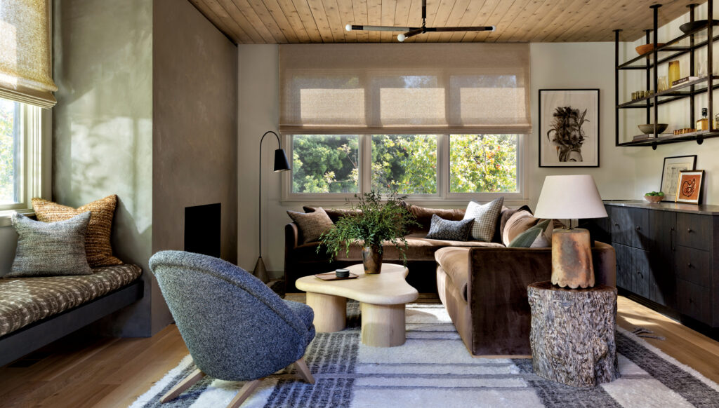
Smoky Taupe

When designer Holly Kopman is choosing a rich-looking hue, she opts for “colors that feel like suede when you look at them.” Lately, she’s been reaching for a smoky taupe color that looks soft to the touch. It adds more depth to a room than a white or off-white without being overwhelming.
If you’re looking for elegant pairing ideas, try smoky taupe with robin’s egg blue or a deep green, or a crisp white for something brighter.
Our Favorite Smoky Taupes

Glidden Whiskers

BEHR PREMIUM PLUS Perfect Taupe
Charcoal

A dark gray tone, specifically in a limewash paint, looks especially incredible and elevated to designer Becky Shea. The depth and richness that comes from the subtle texture is timeless yet modern, and the uneven finish gives the room an organic quality. A matte charcoal adds an “understate opulence,” as she puts it, and can help envelop the room so it feels intimate and cozy yet moody and sophisticated.
You can pair a charcoal tone with plenty of different textures, materials, and hues to get an expensive feel. However, Shea loves polished brass, marble, rich wood tones, and plush textiles under soft, diffused lighting to really make an interior feel harmonious and grounded.
Our Favorite Charcoals

HGTV HOME by Sherwin-Williams Cloak Gray

Farrow & Ball Down Pipe
Dusty Blue

Designed by Erica McLain.
Typically lighter than navy but not as vibrant, a dusty blue is another shade that designers love to use to make a home look more expensive. “Rich and complex, these shades feel both modern and nostalgic, drawing inspiration from the deep hues of old world textiles and timeworn patinas,” designer Erica McLain explains. Since a dusty blue is a blend of blue and gray, the hue adds an air of tailored elegance.
For designer Arianne Bellizaire, this complex color feels bespoke and looks refined on cabinetry, millwork, or walls. Other hues this shade pairs well with include crisp whites, warm metallics, and light wood tones.
Our Favorite Dusty Blues

Stainmaster Office Blue

BEHR DYNASTY Blue Moon Bay
Plaster

Rather than a particular hue, Kim Gordon of Kim Gordon Designs likes to bring texture to a wall for an expensive look. From limewash to clay plaster, they make a traditional bright white look elevated and sophisticated, she says. No matter which color you go for, a textured finish on the walls will add a touch more elegance every time.
If you want to keep it more traditional, Gordon suggests pairing a white plaster wall with pops of jewel tones.
Related Story
Celery Green

Many of the colors that make a home look more expensive are on the darker side, but designer Tom Riker of James Thomas Interiors goes for something light: celery green. “Shades of green are making their mark in kitchen design, and we love how this hue extends into the adjoining rooms, allowing the eye to rest and fully take in the stunning views and rich textiles,” Riker says. This bold choice, especially if used in a high-gloss sheen, adds so much light and happiness to a room.
Since celery green is already such a statement, opt for off-whites and dark accents to pair with the hue for depth and dimension.
Our Favorite Bright Greens

Glidden Gracious Glow