By Carrie Whitney
Atlanta-based designer Jennifer Crosby had known her client for more than 20 years, and she had designed three houses and an office for him. When he asked her to renovate his new penthouse at the Loews Atlanta Hotel, envisioning the design and getting approval from the client was relatively straightforward, but it was also just the beginning.
Crosby, who is president & CEO of Crosby Design Group, works primarily in new construction. She said a renovation project like this one introduced special challenges like tying the design into the existing structure in a way that makes it look like it was always there. Coupled with the limitations of working at the top of a high-rise as far as access, available power and weight limits, she had a lot to contend with.
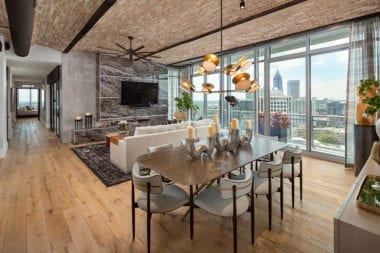
“The vision that I had immediately was to completely gut everything in the entire condo,” said the designer and explained that her concept was to transform the typical-looking space into a home reminiscent of a refurbished 1900s Manhattan penthouse. “Having the existing ceilings would not allow that design to work.”
And so, the demolition began.
Structural Changes
To initiate the complex project, Crosby Design Group generated full construction documents. The team tore down walls to create connectivity and demolished the dropped ceilings to make the rooms feel larger. Removing the sheetrock extended the ceilings to the maximum height available, which meant leaving plumbing and HVAC exposed in the main living area. To celebrate this, Crosby painted the 10-in. ductwork matte black, which reinforced the renovated Manhattan-loft style. In the kitchen, adding a layer of skim-coat concrete to the ceiling gave it an industrial vibe. The same concrete look was used on existing chases throughout the space to create the look of exposed structural columns.
To the newly high ceilings, the designers added barrel-like curves to some areas with Durock cement tiled with thin brick. Reclaimed wood ceiling and wall treatments added even more character. A foyer coat closet was removed, which allowed more space in the kitchen, and a custom mudroom-style bench was added to the entry area to accommodate coat storage.
“Precise and descriptive construction drawings were key to ensuring that all demolition and reformation was done according to our vision,” said Megan O’Hanlon, who created the construction design documents in Revit. “We had to be cognizant of existing structural walls, plumbing and HVAC requirements throughout the entire process. Some of these elements had to be designed around, but we were able to incorporate them into the desired aesthetic.”
Customizing the Kitchen
Changes in the kitchen below the ceiling began with increasing the footprint by moving it out three feet. The concept of the peninsula was maintained, but Crosby included a waterfall on both ends, which gives it the illusion of being an island. Taking the kitchen cabinets to the ceiling offers more storage and the impression of greater height.
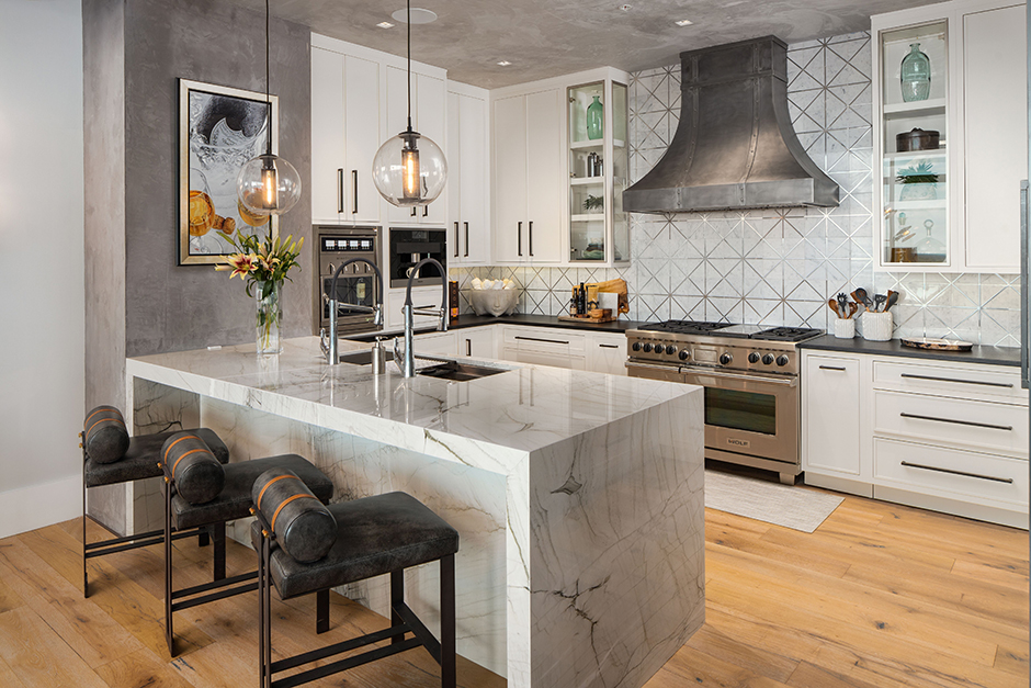 The previous kitchen had dark cabinets, a smaller profile and a thin slab on the peninsula. Crosby added custom and high-end finishes to the new gourmet kitchen like a 4-ft. sink with dual faucets, a restaurant-level wine dispenser, built-in coffee service with a direct water line to the extra beverage undercounter glass cooler, a paneled refrigerator and freezer and a 48-in. range with grilling options. It required moving gas and water lines, as well as adding more water lines for the coffee.
The custom cabinetry includes two-sided glass cabinets on either side of the stainless vent hood, allowing for profile visibility. The island countertop is quartzite with edges laminated to exaggerate the thickness. It looks like a 3-in. slab, but it is simply built up on the edges to appear that way, keeping it an acceptable weight for the penthouse limitations. The marble backsplash has stainless-steel grout, adding shine above the granite countertop with a leather finish.
Master Bath
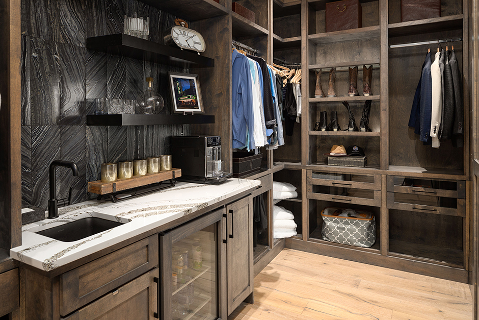 The master bathroom, which is now accessible through a walk-in closet complete with a morning bar, also got a total upgrade. Initially, the floor plan included a door from the master bedroom into the en-suite, but that required the bed to face away from the window. To situate the bed for the best view, Crosby enclosed the connecting door, created a more substantial doorway into the closet and opened the closet into the bathroom. The wall from the closet is covered in mosaic marble tile, promising the luxury to come in the bathroom.
 The designer knew the client would appreciate the convenience of having a morning bar in the master suite – in fact, she had incorporated one in previous residences she had designed for him. This one includes a sink, an undercounter glass-front beverage center and an ice machine that can also be used to chill a bottle of champagne while the homeowner takes a steam shower. There is a handy charging station for electronics, and LED lighting in the closet highlights the tile backsplash.
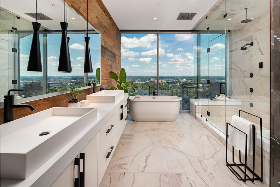
In the en-suite, a massive walk-in steam shower with dual benches and a glass enclosure reaching to the ceiling dominates most of one side of the bathroom. It was enlarged by 3 feet from the previous shower and includes two showerheads, rain, heat, steam, body sprayers and aromatherapy.
“Everything you could imagine is in there,” said Crosby.
While the steam is located in the ceiling, the access panel was hidden behind a grill in the water closet to provide easy access to the mechanical in the event maintenance or repair is needed. The water closet is closed behind a custom pocket door that takes up no space.
On the opposite side, cabinets float on a wall of reclaimed 18th-century wood from a barn in Dacula, Ga. A heavy quartz countertop, trough sinks, a backlit mirror and matte-black pendants complete the vanity area. At the far end of the room, a soaker tub – reused from the previous bathroom – takes advantage of the window wall.
Keeping it Lofty
Guest bathrooms and a powder room continue the Manhattan-style mix of old and new. In one, a simple vanity meets 12-by-24-in. wall tile and globe sconces. Below, the floor tile mimics painted concrete with a fun pattern.
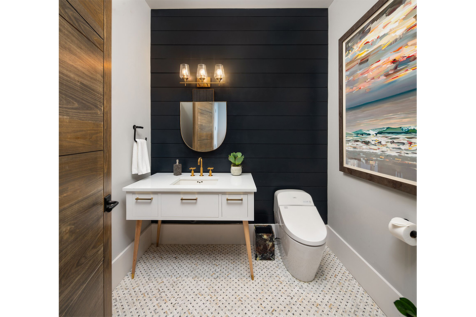
The powder room has a marble mosaic floor, custom-designed vanity with slim legs and a smart toilet. Here, Crosby mixed matte-black accessories with a gold-finish faucet. The shiplap wall with a penny gap has been painted dark for contrast.
 Changes in the laundry room included moving the placement of the washer and dryer so that its wet wall could be closer to that of the master closet morning bar. The floor is wood but stained with two tones – a navy-black and light wood – to impart a parquet-application look. The laundry room has automatic lights and cabinets in a similar door style to the kitchen, although with a different reveal. Cambria quartz countertops are stain resistant and paired with a mosaic backsplash.
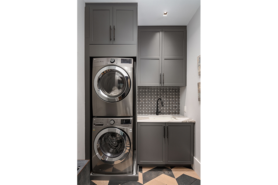 “We were able to grout the black tile with a white platinum-gray grout to give that positive-negative high contrast that is a splash of detail,” said Crosby.
Throughout the penthouse, each space received the same level of meticulous renovation. Taking about a year from start to finish, the project had to be completed during limited work hours determined by the property and even movie industry people living in the building.
“Everything was coordinated and orchestrated around that schedule,” said Crosby.
In the end, despite the challenges of working within a confined space and limited access, she and her team were able to build character into the home and bring in the Manhattan style it was always meant to have.
Source List
Designers: Jennifer Crosby & Megan O’Hanlon, Crosby Design Group & Megan O’Hanlon
Photographer: Iran Watson
KITCHEN
BAR STOOLS: Michael Habachy
BACKSPLASH: Walker Zanger
BEVERAGE CENTER & REFRIGERATOR: Sub-Zero
CABINET HARDWARE: Hardware Resources
CABINETS: Dove Cabinets
COFFEE MACHINE: Miele
COOKTOP, MICROWAVE & RANGE: Wolf
DISHWASHER: ASKO
FAUCETS: Kohler
FLOORING: Provenza
GLASS CABINETS: Clean Cut Fabricators
HOOD: Wolf (Custom vent and straps)
PENINSULA COUNTERTOP: Daltile Quartzite
PENDANTS: Sonneman
SINK: Galley
WINE DISPENSER: Dacor
MASTER BATH
COUNTERTOP: Cambria
FAUCETS, SHOWER SYSTEM & SINK: Kohler
FLOORING: Interceramic Tile
HARDWARE: Hardware Resources
LIGHTING: Circa
LIGHTING CONTROL: Lutron
MIRROR: Parris Mirror
SHOWER ENCLOSURE: Frameless
SINK: Kohler
TILE MASTER CLOSET & WATER CLOSET WALLS: Daltile
TOILET: TOTO
VANITY: Dove Cabinets
MORNING BAR
BEVERAGE CENTER: Sub-Zero
CABINET: Custom – Kaysyn Cabinetry
COUNTERTOP: Cambria
FAUCET: Kohler
ICE MAKER: Scotsman
SINK: Kohler
TILE: Interceramic
GUEST BATH
COUNTERTOP: Cambria
FAUCET & Sink: Kohler
FLOORING: Interceramic Tile
LIGHTING: Beautifulhalo
MIRROR: Four Hands
VANITY: Custom by Clean Cut Fabricators
WALL TILE: Interceramic Tile
POWDER ROOM:
CABINET HARDWARE: Baldwin
COUNTERTOP: Vicostone Quartz
FAUCET & SINK: Kohler
FLOORING: Interceramic Tile
LIGHTING: Savoy House
MIRROR: Uttermost
TOILET: TOTO
VANITY: Custom by Clean Cut Fabricators
LAUNDRY ROOM:
BACKSPLASH: Interceramic Tile
CABINETS: Dove Studios
COUNTERTOP: Cambria
FAUCET & Sink: Kohler
FLOORING: Trinity Flooring
LIGHTING: Circa
WASHER/DRYER: LG
source: kbbonline
About ARCHEN News
ARCHEN News is a digital media platform connecting manufacturers of building products with the architectural, design, construction, engineering, property management, and contractor communities, promoting new product releases and interesting projects. contact@archennews.com or (646) 494-5102

