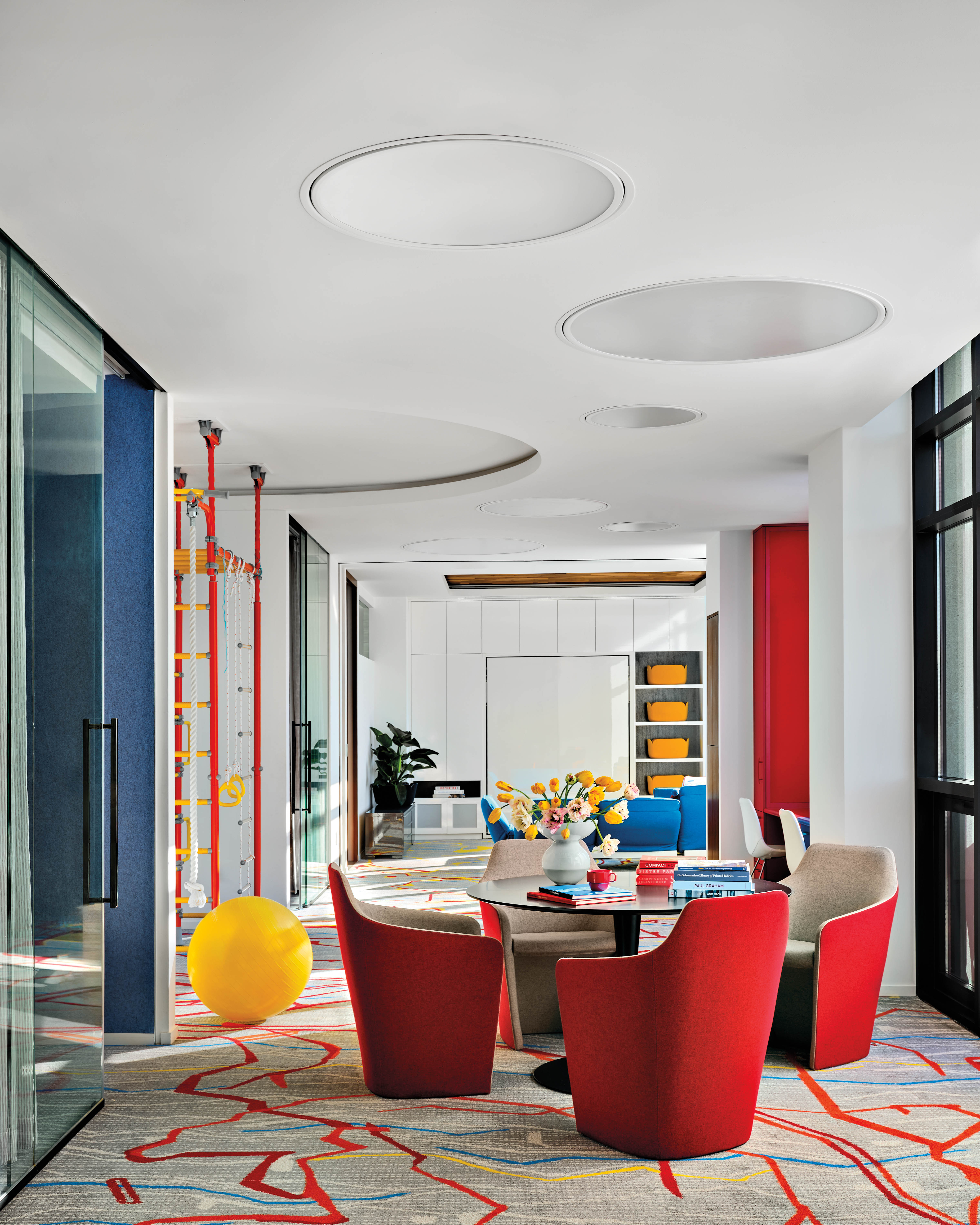
3. Try Accessories + Materials In Primary ColorsThe inherent boldness of primary colors makes them a fun addition to modern residential design, but that comes with a caveat. “Primary colors have an inherent energy, and the key to using them successfully in a home is strategic restraint,” shares the MK Workshop duo.With the less-is-more approach in mind, homeowners can start with pops of color before going all in. “Instead of treating them as the dominant feature, we love using deep blues, rich reds and mustard yellows as accents—whether through upholstery, cabinetry or even lacquered millwork,” say the MK Workshop designers. “A high-gloss blue door, a deep red velvet sofa, or a striking yellow pendant light can add dimension without overwhelming the space.” Keep your overall design style in mind when deciding where a primary color might shine. “Bringing in colors through art, accessories and even books and their book jackets and spines is a way to ensure the story is cohesive throughout the home,” shares Ariel Okin of Ariel Okin Interiors. Go bold with a row of red books or keep it subtle with textiles and furnishings in yellows and blues, like Okin did in the charming dining nook featured here.